Train For Every Play
Problem Statement
The Super Bowl is the easiest conversation starter in America. Your grandpa talks about what it used to be like. Your nephew asks about the halftime show. Everyone's got an opinion.
But in the middle of this spectacle lives a group of people who—let's be honest, you endure at best and actively resent at worst for their questionable decision-making. The refs. You ever wonder who thinks, "I want 150 million people judging my every decision"?
They train for this. But here's the catch: traditionally, the only training method was making mistakes in real games. No practice environment. No safe reps. Just trial by fire until you either develop instincts or quit.
My client built an app to fix this, a platform where officials experience real scenarios and build game-ready skills before Friday night. They needed a website to introduce the solution and drive demo sign-ups.
3
11
30+
Project Scope
Lead UX/UI
Designer
Position
2 Months: Discovery, Architecture & Design
Stages
Web Design, Sports Tech, SaaS Design
Industry
App Interface
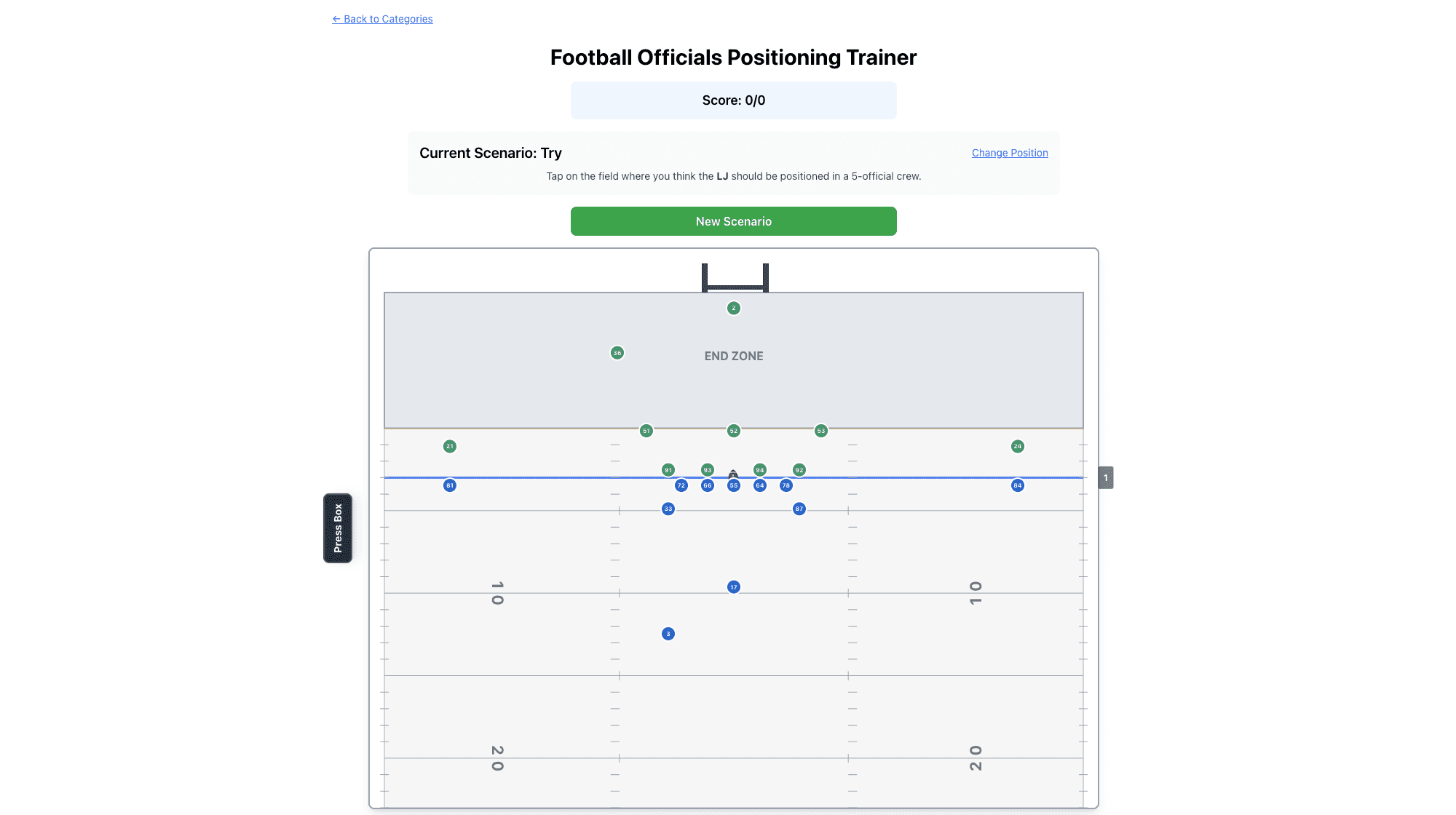
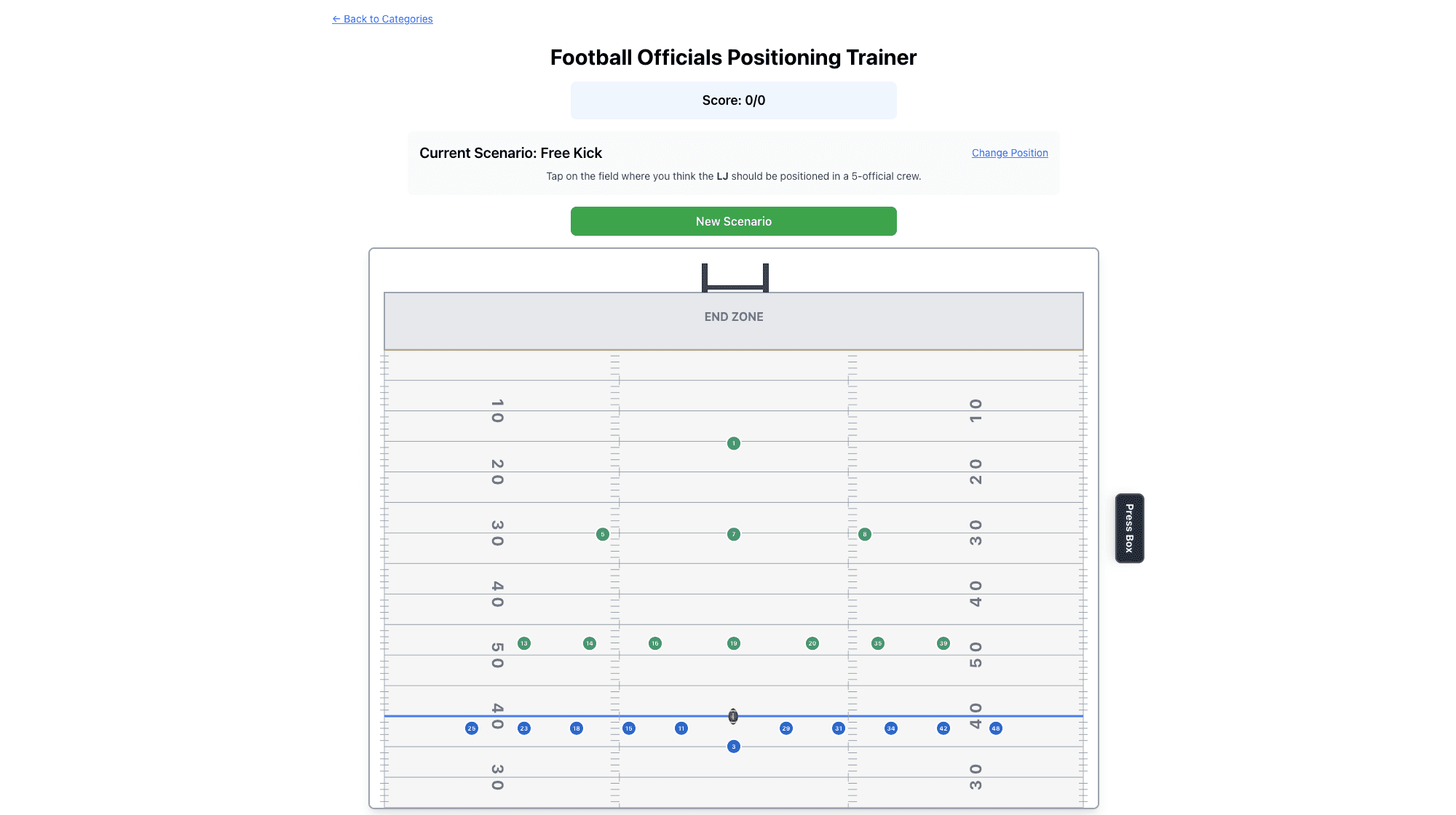
The client provided the beta version of their app along with their vision for future development. I dove deep into the existing functionality, exploring its potential and identifying opportunities to enhance the user experience through intentional design.
Solution
A website designed to drive demo sign-ups and attract funding. Clean, intuitive, and bold, capturing the energy and nostalgia of Friday night lights while showcasing a cutting-edge training platform.
Website Design

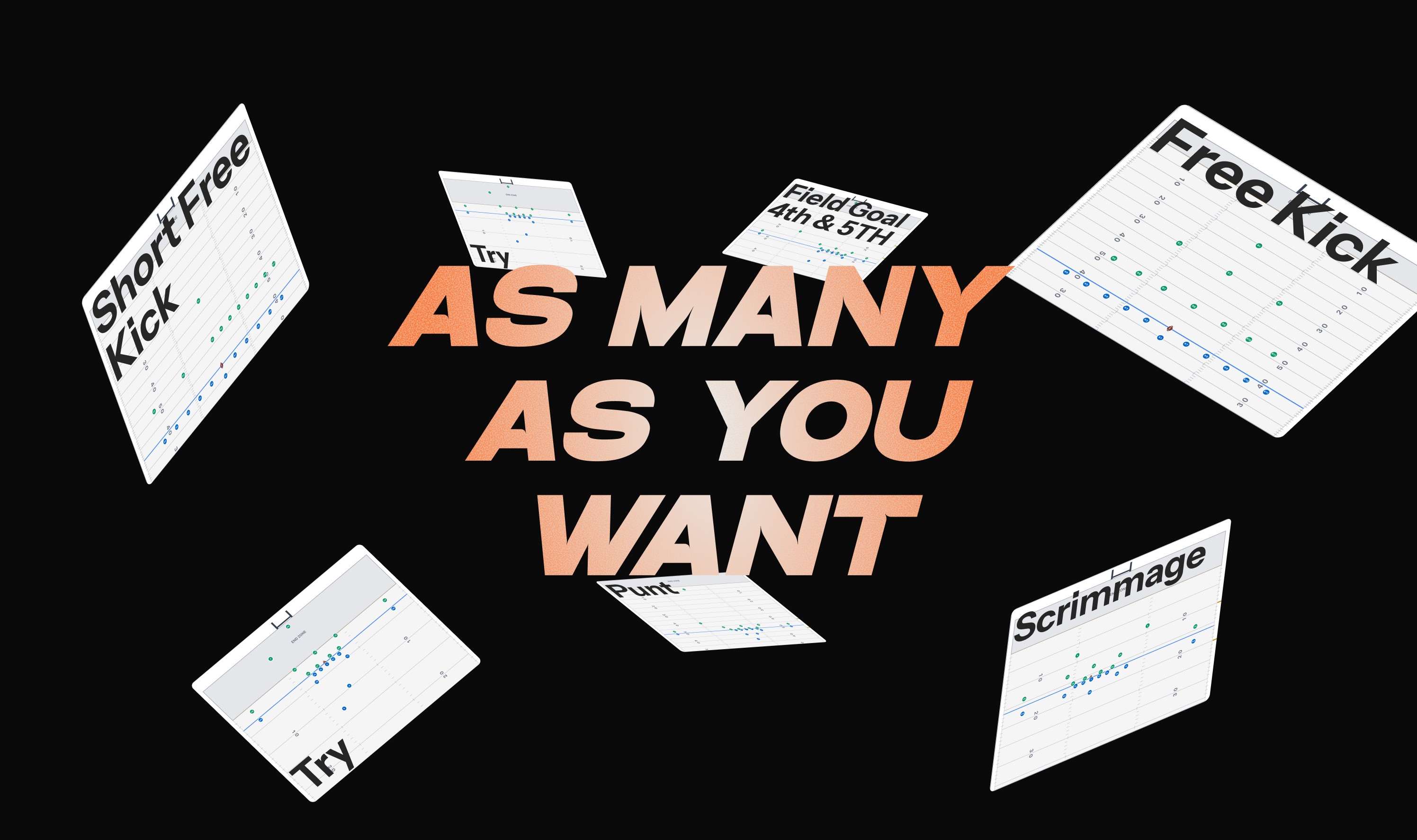
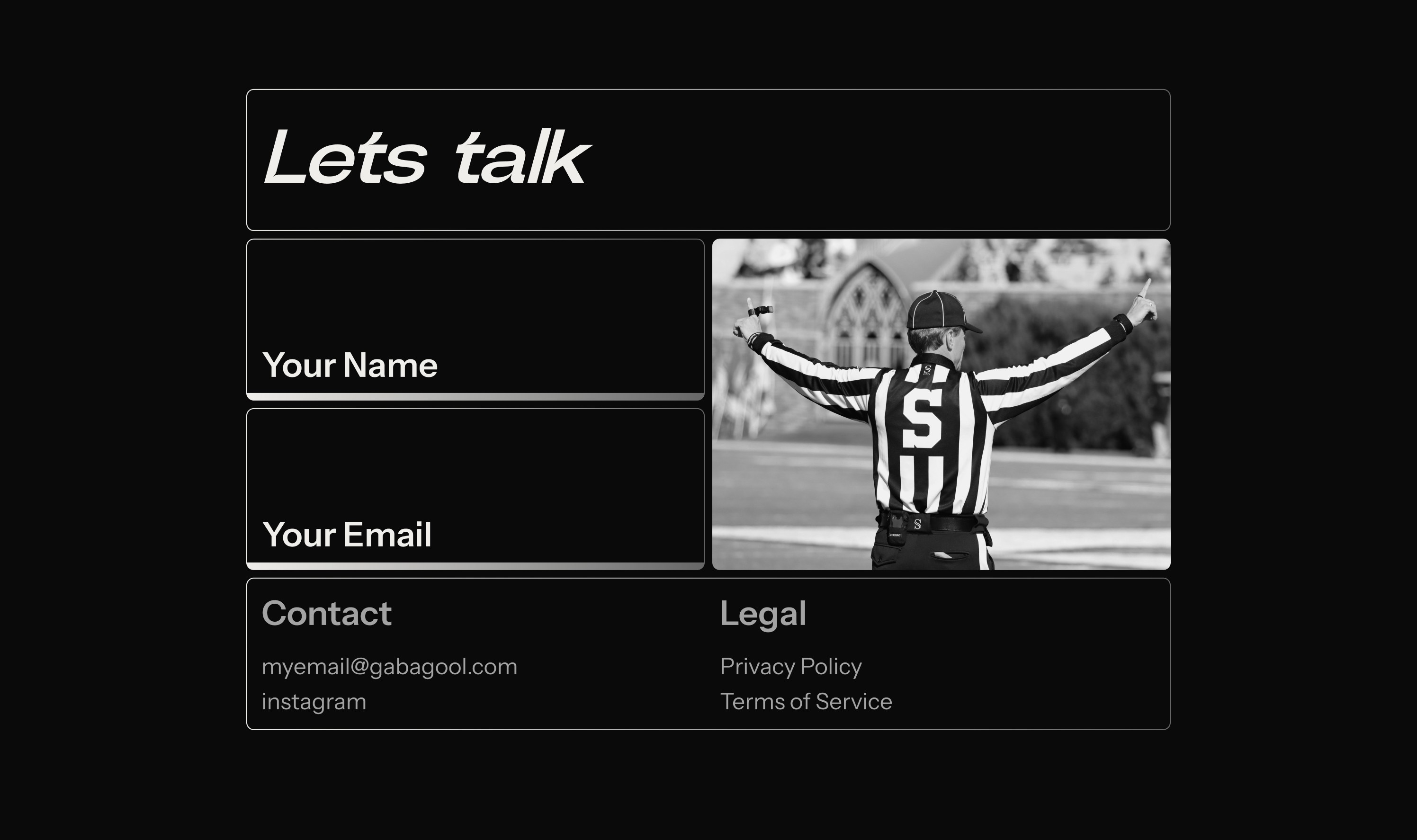
Market Analysis & Moodboard
I researched sports training platforms and football-related products to understand the landscape. What design patterns were working? Where were competitors falling short? What visual language resonated with this audience? This competitive analysis shaped the direction—helping me identify opportunities to stand out while meeting user expectations.
I also studied the core demographic—men aged 30 to 60 who are either active officials or looking to break into refereeing. This audience values credibility, efficiency, and straightforward interfaces. They're not looking for flashy gimmicks; they want a tool that respects their time and delivers real training value. Understanding this helped me strike the right balance: bold enough to feel modern and exciting, but professional enough to earn trust.
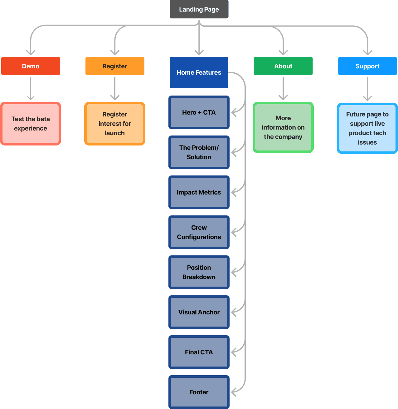
Website Architecture
Even though the initial launch focused on a single home page, I mapped out a scalable site structure from the start. This future-proofed the design—anticipating growth as the product evolves, new features launch, and content needs expand.
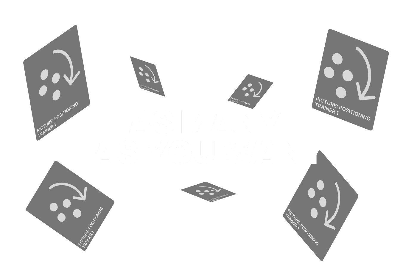
Lo-Fi Exploration
I built grayscale wireframes to rapidly test layouts and section hierarchy. Working in black, white, and grey let me focus on structure and flow without getting distracted by visual polish. These skeleton screens became conversation starters with the client—quick iterations to validate direction before committing to high-fidelity design.
Client Meetings
Weekly check-ins kept the project aligned and moving forward. I'd share progress, gather feedback, and discuss his vision for future features. These touchpoints ensured we were building toward the right product—not just for launch, but for what comes next.

Visual Design & Motion
Once the structure was locked, I layered in the visual identity. Color palette, typography hierarchy, and motion design all came together to create an experience that felt both premium and accessible. Animations weren't decorative—they guided users through the flow, emphasized key actions, and added subtle energy that mirrored the intensity of game day. After several rounds with the client to ensure clarity and impact, we landed on the final design: bold, intuitive, and conversion-focused.


Site Sections
Hand-off and Implementation
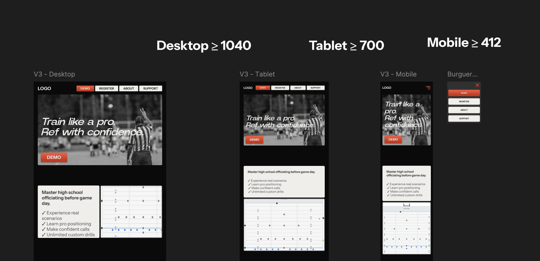
Clean handoff was critical. I organized the Figma file into four sections—Moodboard, Prototype, Components, and Archive—so nothing got lost. Designed the home page across desktop, tablet, and mobile breakpoints, all built with auto layout so developers could see exactly how spacing worked.
Every section became a component with variants. Typography and colors lived in design tokens for consistency. Prototypes showed how everything should move and interact. And to make life easier, I exported React code using MUI—ready-to-use components that cut development time.

Working Prototype
Final Thoughts
Whether you're preparing to referee the Super Bowl or a Friday night high school game, it takes time and preparation. The same principle applies to designing for an early-stage product. Future-proofing requires deeper thinking, more strategic planning, and constant communication with the client. Every decision had to work for today while leaving room for tomorrow. Staying aligned wasn't optional—it was the foundation of building something that could scale.

